Overview
Williams-Sonoma
Experience
Building culinary skill, knowledge, and passion through a digital platform that fits in like any other kitchen tool.
For a 5-week client-focused UX course we selected luxury kitchenware brand, Williams-Sonoma. We identified their business problem as a lack of resources aimed to introduce products to emerging audiences. Targeting novices and aspiring cooks we designed a tool to teach technique, but most importantly the culture and the history behind each cookware. By driving home that an authentic method requires specific cookware, we further develop their culinary skill, knowledge, and passion.
My Role
Deliverables
Team of Six
Interaction Design, UX/UI, User Research, Wireframing, Information Architecture
Nathan Lam, Jacky Chen, Niloufar Kousha, Mandy Wong, Joshua Nicolas, Hasti Khaki
After Effects prototype by Nathan, cinematography by Jacky
Business Problem
Williams-Sonoma’s brand promise has been about focusing on inspiration rather than products.
Customer brand perception has always relied on Williams-Sonoma to provide a luxurious hospitable experience with quality craftsmanship in products.
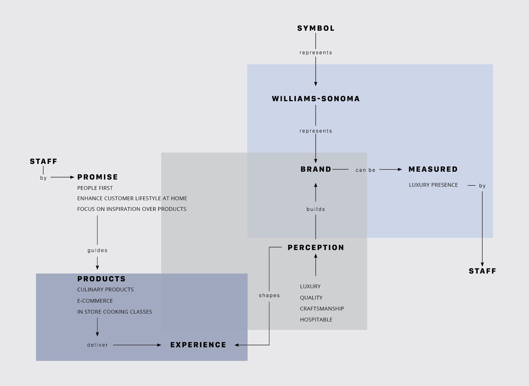
Adapting Hugh Dubberly's Model of Brand concept map
Reviewing Williams-Sonoma’s annual report, revenue has been decreasing from 2010. The hypothesis is the increased competition from the likes of IKEA and Target, dilution of brand from expansion, and lack of focus on their emerging audiences of a younger generation. Williams-Sonoma launched Open Kitchen in January 2014, their own line of quality products at affordable prices.
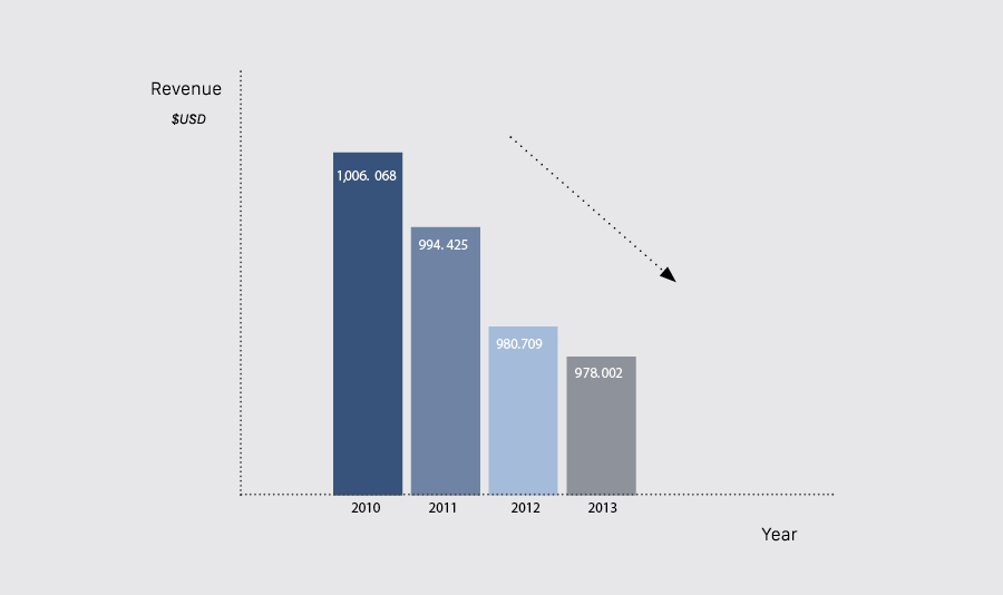
Williams-Sonoma's annual revenue report from 2010 to 2013
Sketching
Recognizing mistakes early and course correcting.
One of my teammates brought up a concern that teaching techniques wasn't enough which built a sense of doubt in my team. It was a fair question especially one week in. I didn’t know how to answer and if you’re going to object, bring something to the table. I took time to start thinking about scenarios. Mother and a child, children love to be adults, what if we can divide tasks based on skill level. It knows you’re splitting with a child so they're given child friendly tasks. The child gets to feel like an adult and there’s this mother-child bond happening. I start buying this idea and I brought it up to the team. I started conceptualizing it on the whiteboard to figure out the flow.
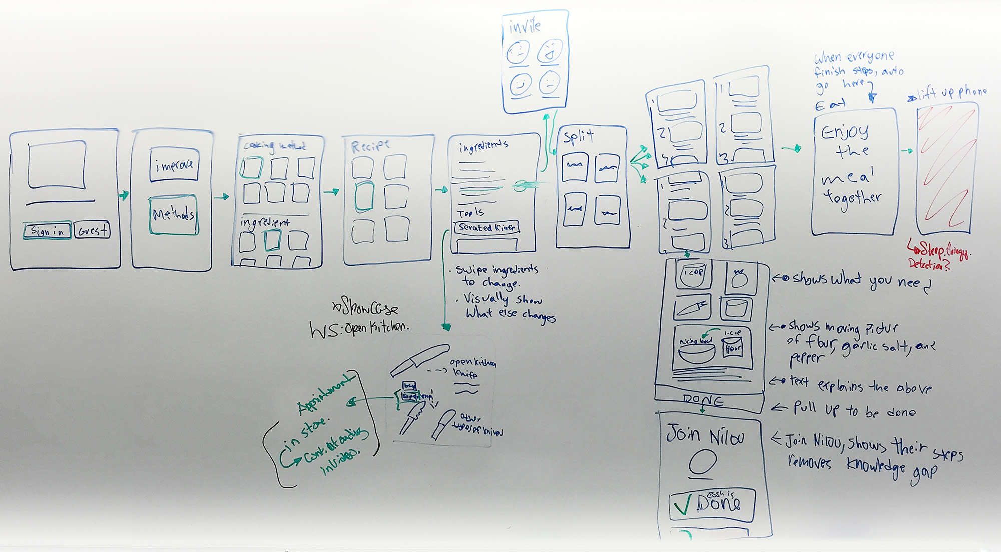
Rapid wireframes of how to select a recipe and split cooking tasks
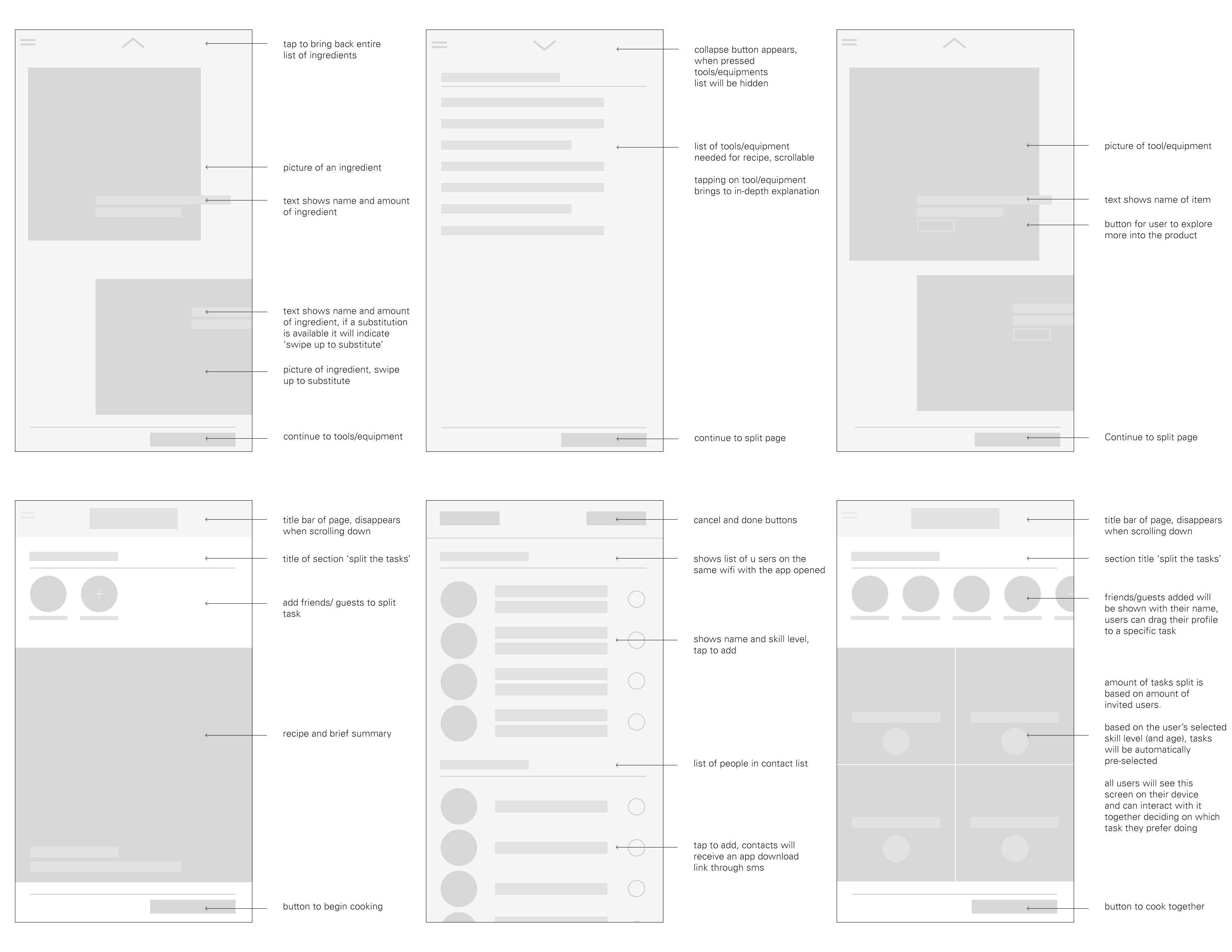
High fidelity wireframes of recipe, equipment, adding friends, and splitting task pages
After I made high fidelity wireframes I knew it was a mistake as it has gotten too complex with profiles, recipes, equipment, substitutions, and task splitting. It’s better to do one thing exceptionally well than multiple things mediocre, so I brought up my concern and we reverted. Although we wasted a week, I managed to catch this problem early.
User Research
To design for use in the kitchen I ran experiments to discover the strongest solutions.
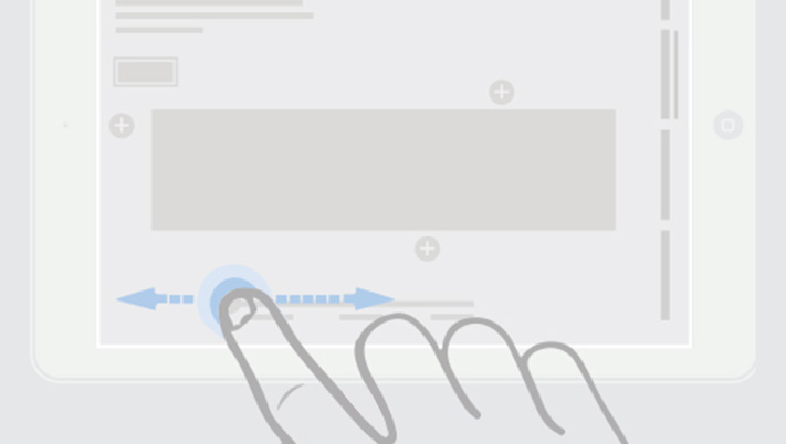
In a kitchen, taps could leave debris that would disable recognition. Swipe interactions had less of an issue as you are not be limited to a confined area.
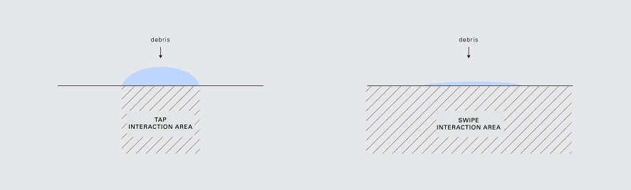
Tap vs. swipe interaction infographic
Interviewing a handful of people who follow cooking tutorials, they tended to pause and rewind often. Pausing had a 1-3 second delay from having to reach for the pause button. Taking note of this, I wanted to allow for the ability to watch at any preferred speed, ease of rewind, and instantaneous pausing. To achieve this, the (silent) tutorials play by dragging the timeline.
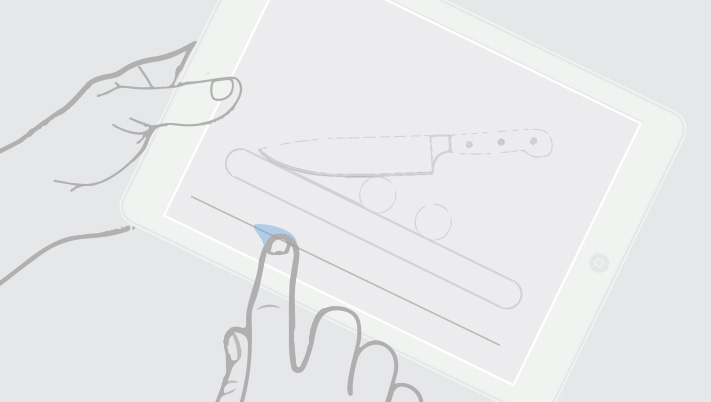
Wireframe of dragging to play
Prototype of dragging to play, rewind, and releasing to pause
By understanding the environment of use, it lead me to the act of placing down the tablet flat during a video to switch to a top-down point of view. This allows people to view hand positions while they attempt the technique.
Lifting and placing the device down switches between two perspectives
While watching people shop for items in the store, people tend to examine products at different angles. To bring this affordance, kitchen tools can be dragged or the device can be tilted to view its craftsmanship digitally. I accomplished this in the prototype by texturing and lighting a 3D model of a wok in Cinema 4D.
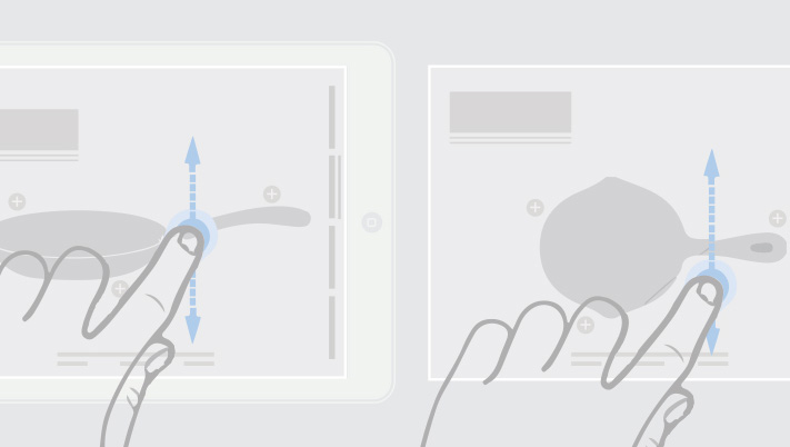
Wireframe of dragging to view different angles of cookware
Prototype of viewing different angles of cookware
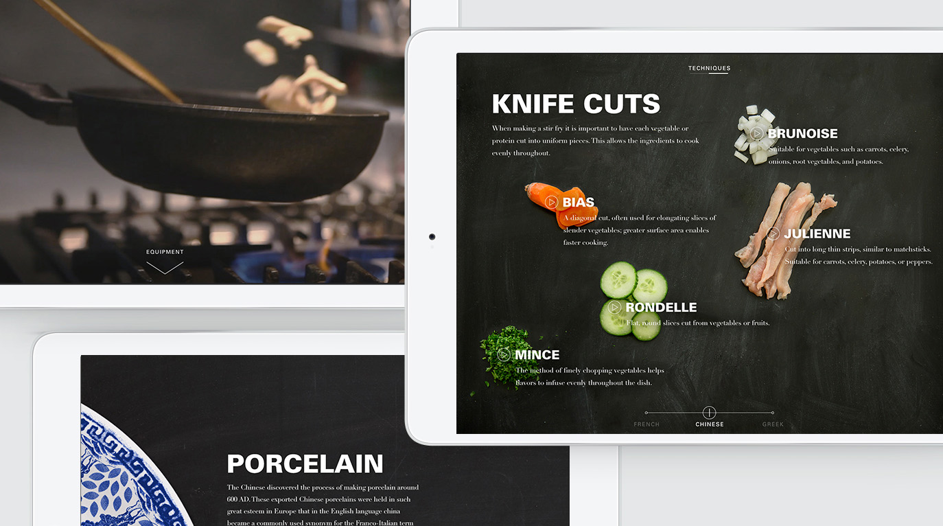
While researching cooking techniques we learned certain methods such as a sauté has different cultural cuisines (cooking style). This lead to the introduction of a slider to switch between and explore deeper into the cultures.
Wireframe of dragging cuisine slider to switch content
Prototype of dragging cuisine slider to switch content
Mockups
Relentlessly referencing the physical world for my design decisions.
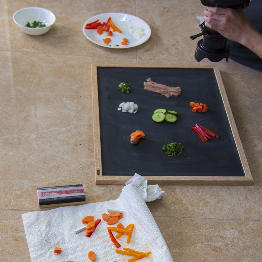
My process involves referencing the physical world. How content is displayed in the UI with the chalkboard background was directly referenced during a visit to a Williams-Sonoma store.
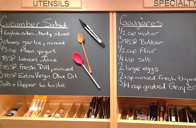
Williams-Sonoma retail store item display on chalkboard
Photographing food on chalkboard for UI
Smallest of details were considered. During the cooking screen that instructs that a wok should start to smoke at a 350 degrees, I included a slight smoke effect to appear on screen to give more depth and delight.
Light smoke effect detail appears when the wok is heated to 350 degrees
Keeping it experiential and not so much selling.
We first introduced being able to purchase the products on the last screen of the equipment page. In the end it felt disingenuous, like a bait and switch. It felt best to leave it as is and keep it a genuine experience. Building brand loyalty will have the audience visit the store on their own terms.
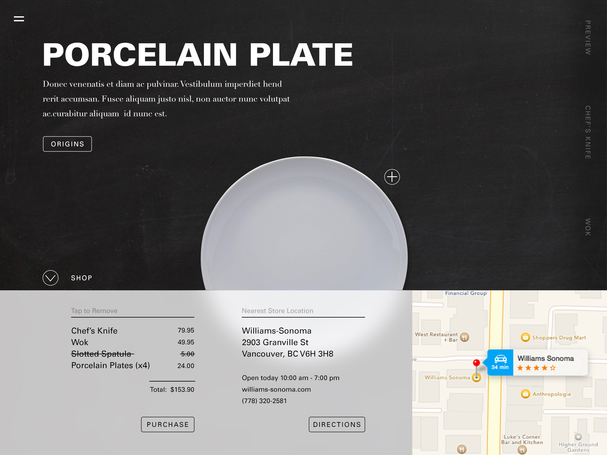
Scrapped design allowing the audience to purchase all equipment seen
Reflection
Taking the UI further.
To take the UI further I would use a new body type to increase the legibility. Additionally, I would introduce stronger signifiers in the UI to make the interaction explicitly clear. One example is introducing pointed ends on either side of a horizontal slider handle to emphasize sliding left and right. The origins page could become more interactive instead of a wall of text. These rumbling of ideas could take the project even further.