Microsoft
Garage
Microsoft Overview
Challenging my creative thinking in UX for three experimental projects at Microsoft.
(Due to the nature of the projects, I am restricted to what I can show)
Each project yields two main designers chosen by their preference. I chose to primarily work on Xbox and Smart Headphones as I could bring a strong understanding of interaction design and undertook in-depth research of the platforms and audience. This did not stop me from being involved in the iOS project, 'Seeing AI'. Driven by my passion and empathy for the project, I made major interaction contributions to be considered as a main designer by the team and the sponsors of Seeing AI.
My Role
Seeing AI, Team of Three
Interaction Design, User Research, TV and Non-Visual UX / UI
Nathan Lam, Karen Lai, Wendy Lu
Xbox, Team of Three
Nathan Lam, Juan Henao, Sara Kiani
Smart Headphones, Team of Two
Nathan Lam, Sara Kiani
Seeing AI Overview
Providing people with visual impairment an unobtrusive way to regain their independence by describing their surroundings.
Designed for the visually impaired community, we utilize AI to describe nearby people, text, objects, and the environment. During my time we optimized for high contrast and for VoiceOver (iOS screen reader) for those with low vision or without sight.
User Research
Obsess about the audience, in order to design for the visually impaired, I must grasp their lifestyle and their daily obstacles.
During my off work hours I took the initiative to understand the lifestyle of a person who relies on accessibility features. Through relentless self hosting I used VoiceOver on my personal device for an extended amount of time to learn what it has to offer through real life usage. I was able to learn that voice over is able to read meta data of a photo. It can describe if a picture is too dark or blurry which would help with feedback with with Seeing AI. This was an important finding as my developers were unaware VoiceOver/iOS had this capability.


Picture taken relying on the Seeing AI without my sight
Making my way back to my workspace without any assistance
Without vision relying on the prototype app and a walking cane, I navigated from the presentation room, to the kitchen, grabbing iced tea, and returned to my desk. Juggling a drink, walking cane, and taking pictures with the potential of a thumb covering text, this experiment showed me one hand usage and audio feedback needed to be be more successful.
Usability Testing
Audience involvement through user testing.
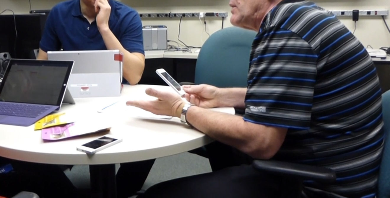
Regularly tested internally in the lunchroom but also with directly with the target audience through a foundation for the blind. I was able to prepare questionnaires and have the audience do a think aloud walkthrough. For a non-bias or a fluffed responses, I had participants explain to me how this would have helped them yesterday. This helps bring a real world scenario or memory for the participant to reference which is more insightful than a response with no substance.
Think aloud walkthrough and questionnaires with visually impaired participant
Quality Assurance
Driving usage of the product, constantly.
Recognized by my program manager, I was one of the only designers who actively reported bugs found in VSTS (Visual Studio Team System), reviewing and approving a bug fix. When available and out of interest I would put on the developer hat and push front end bug fixes in the Xbox project.
Most effective and fastest way to communicate.
In order to better communicate inconsistencies or visual bugs, I used sticky notes to physically measure alignment of elements, slow motion video to capture jitters in animation, and macro photos to capture the position or size of pixels. This proved to be the most effective and fast ways to communicate to my developers.


Rapidly analyzing the alignment of elements through the use of sticky notes on a TV
Taking an macro photo of the TV to check for pixel perfect alignment and sizing
Reflection
Dream of the best experience but still jump back to what is viable.
During the internship I was able to experience an accelerated development process which included unforeseen scenarios, such as unexpected hardware limitations which required a pivot in design. In an instance like this it’s important to believe in your product and be passionate, if it is lost you need to find it. If you don’t believe in it, why should your audience. I stayed a dreamer but had viable solutions that can work towards that dream experience. A strong designer can dream of the best experience and still jump back to what is viable and within scope.
Less talking, more making.
By making a concept through sketch or digitally you have something that can drive discussion, be referenced, built upon, and shared between team members. Having something 'tangible' helps with communication and iteration.
