Municipal Design
Overview
Improving the reporting process for city services by having it anticipate and contextually aware.
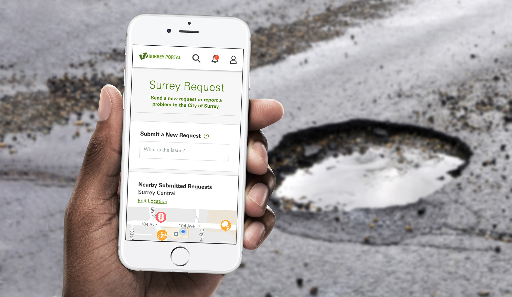
'Surrey Request' allows people in the city to report and track city services. The core brief was to reduce duplicate submissions and the number of service categories. A constraint is that its part of a web app suite and runs CityWorks (an enterprise work and asset management solution).
My Role
Team of Two
Information Architecture, Interaction Design, User Research, Visual Design
Nathan Lam, Janice Ng
User Research
My Audit and breakdown of the existing web app.
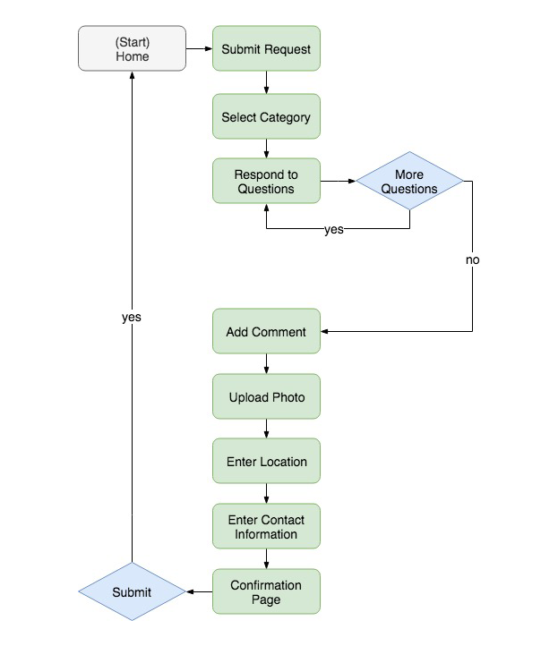
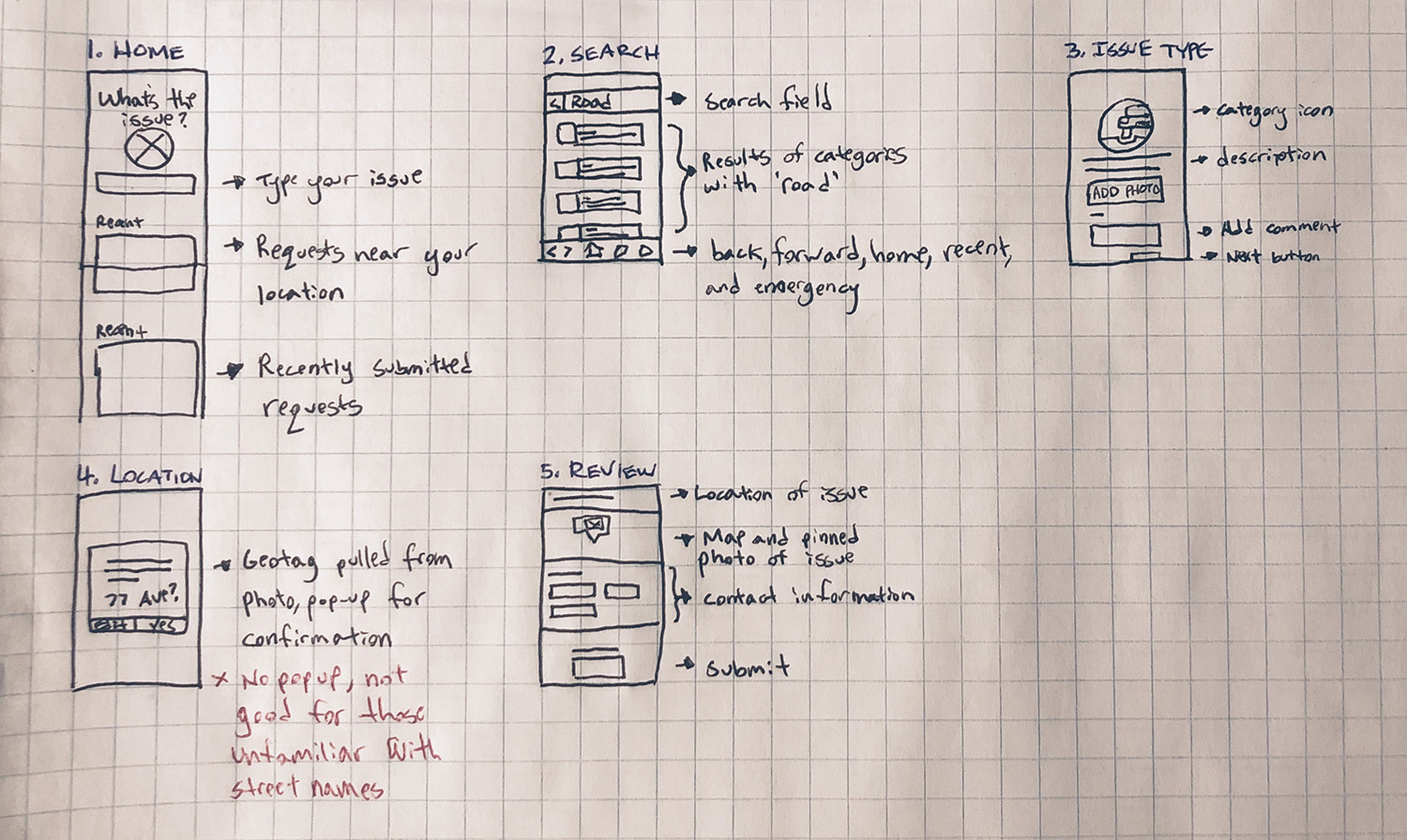
Conducting an app review, I built a hero flow to break down the different stages required to complete the core task.
Walkthrough of the existing web app
Hero flow of the existing web app
To compare findings, my partner and I conducted walkthrough usability testing with people in the city and (PM, QA, BA) colleagues. The task was to submit a report for a fallen tree, it could categorize as ‘Parks Issue’ and ‘Tree Issue’. This lead to a key problem where the category selection was not indicative of your report. Holistically the experience leaves a lot to be desired.
Participants were unclear with the categories in the existing web app, especially when it can fall under two
Understanding usage with real data.
I asked for all the available app analytics and discovered that 'Other' had the most amount of hits. Reviewing submitted reports revealed that they were not unique submissions, they could easily belong to the existing categories.
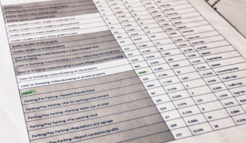
Average hits on each category are 3 digit numbers, 'Other' has the most hits with a 4 digit number
My analogy for this is an automated phone answering system.
People are choosing to submit to the 'Other' category to save time from scanning for the correct category and to avoid lengthy follow up questions. This is similar to people pressing '0' to skip automatic answering machines for a real representative.
A service broken down to 4 different user types, leading to a reframe.
After understanding the product and the people, the key insights were transparency, progress, and being understandable. I reframed the brief from reducing duplicate submissions and categories, to how might we streamline the long extraneous reporting process for more accurate submissions.
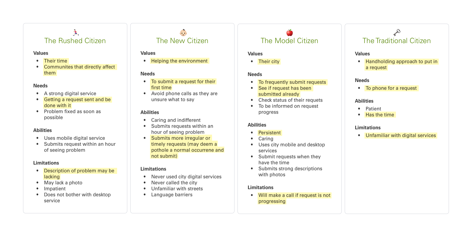
Four different user types influenced by user research with highlighted key points
Sketching
Thumbnail sketches inspired by search UI patterns.
Doing quick sketching, my common theme was anticipating the person's needs.
My quick sketches and annotations during a meeting
By asking myself questions as I sketched, it lead me to understand context of usage and the idea of utilizing existing smart phone features. Pictures taken capture a geotag stored in metadata, which then can be utilized to automatically input the location when submitting a report.
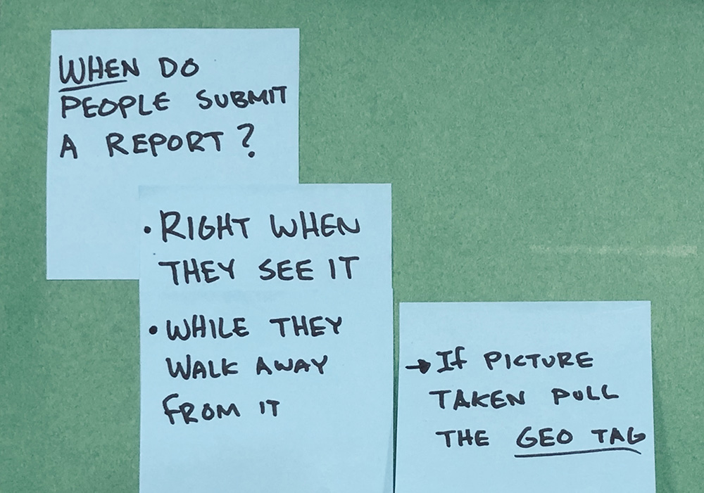
Writing questions and notes to myself as they come up
I compiled a new hero flow, identifying functionalities needed for development to make sense of how the concept would work.
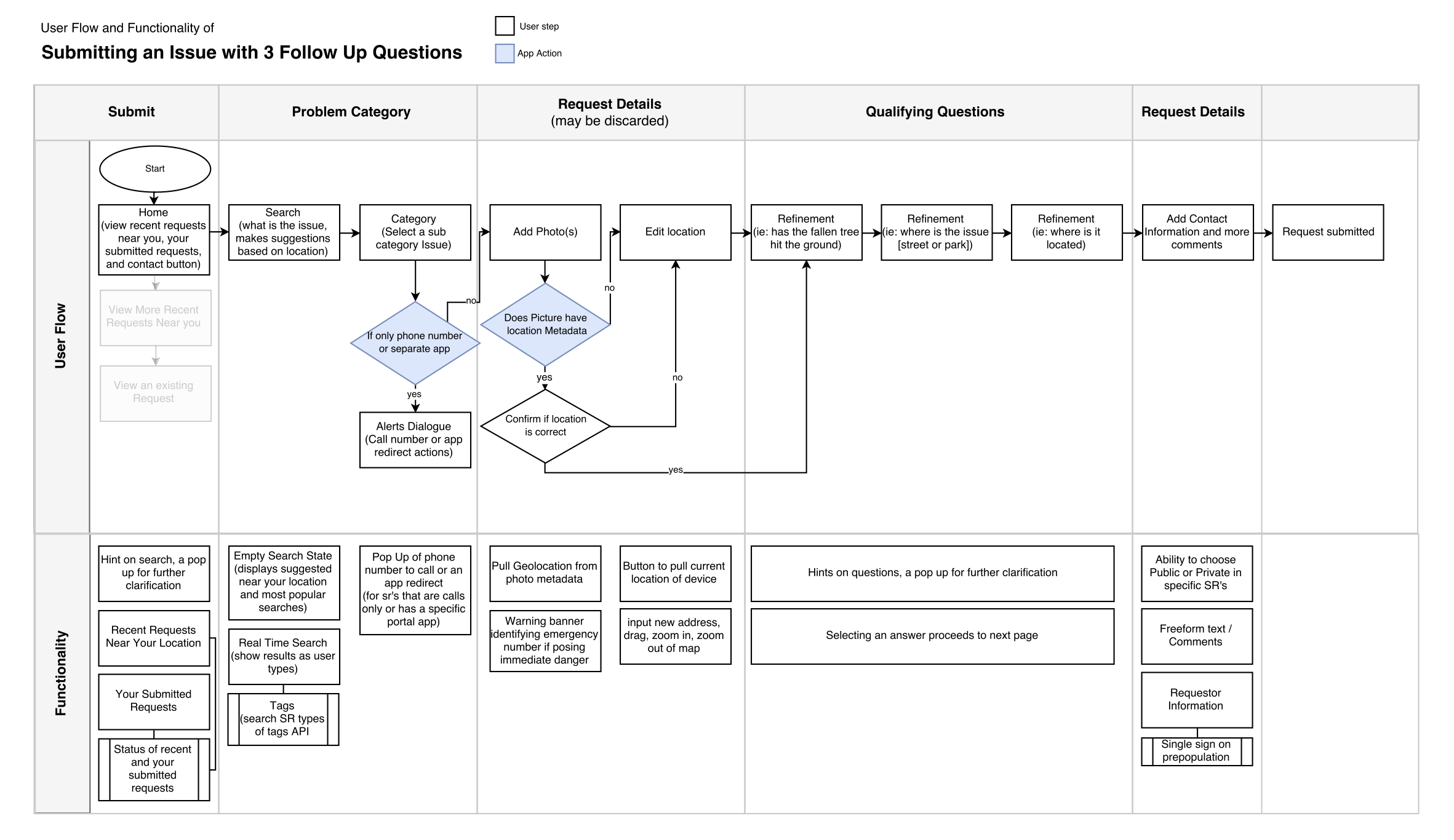
New hero flow to communicate the concept and functionality requirements
Usability Testing
Rapidly prototyping and testing different patterns, while making on the fly adjustments.
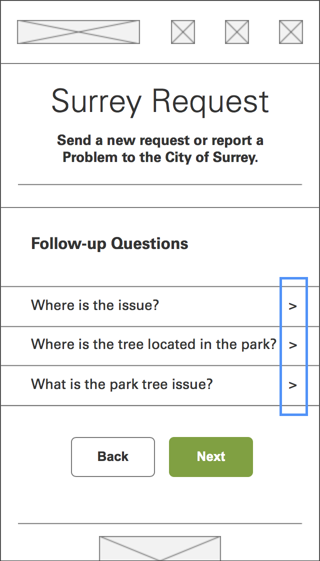
To identify the strongest UI for answering follow up questions we rapidly created interactive prototypes in Axure and ran tests. For best results of testing three patterns per participant, we cycled the arrangement from ABC, to BCA, to CAB.
Prototype A shows all questions and its available answers to be selected on the same screen
Prototype B shows all questions, upon tap of a question is a new screen with the available answers to select
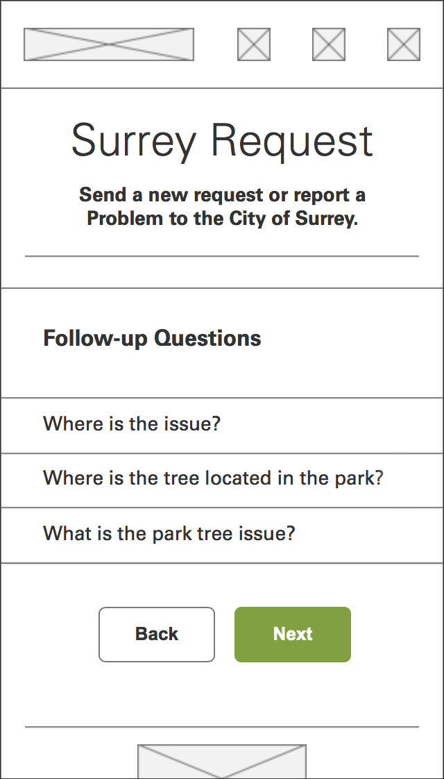
Prototype C shows one question with its available answers, upon selection it proceeds to next question
For the the most valuable responses, I made an effort to make prototype changes to obvious oversights. In version B, it lacked a signifier that the questions were selectable, this was fixed and ready before the next participant.
Initial rapid prototype
Less than symbol inclusion to prototype to ensure questions appear selectable
Assumptions were proven wrong.
My initial assumptions was that showing one question at a time can be problematic as it results in additional screens. Through testing, many preferred one question at a time (prototype C) as it had the “Illusion of feeling faster”, and a “sense of satisfaction”. Also favoured was the ability to review your answers (prototype A & B).
Prototyping with myself during revisions.
While revising prototype C I thought of a new approach by using natural language. I made a paper prototype with myself and saw that it was a more inviting approach to answering follow-up questions. Unfortunately it was not inclusive, Surrey is a diverse city with many non-english speaking people who rely on the Google Translate extension. This would make natural language UI more difficult to understand compared to other UI.
White paper is static text, blue paper is dynamic text selected from a dropdown menu
Mockups
Two high fidelity prototypes specialized for motion and for turnaround time.
Being able to interface with a design reveals nuances and discussion. I prototyped in Flinto for complex animations, meanwhile a click through prototype with InVision was used to refer to the most up to date screens. Iterating on feedback, the back button discoverability was strengthened and more visual design was included for stronger differentiation between the sections (stroked grey, green, and orange circles are placeholders for icons).
Flinto prototype, more complex and movement focused
InVision prototype for faster turn around after making changes
Reflection
Rethinking citizen vs. government responsibility.
A citizen shouldn’t be concerned of duplicate entries. The government’s service should be smart enough to identify a duplicate in its backend, or utilize that entry as an indicator of urgency. To further the notion of anticipation and being contextually aware, common report types around the area can be prioritized on the homepage. These can be actionable to initiate a submission from the homepage. Testing would be required to validate this concept.
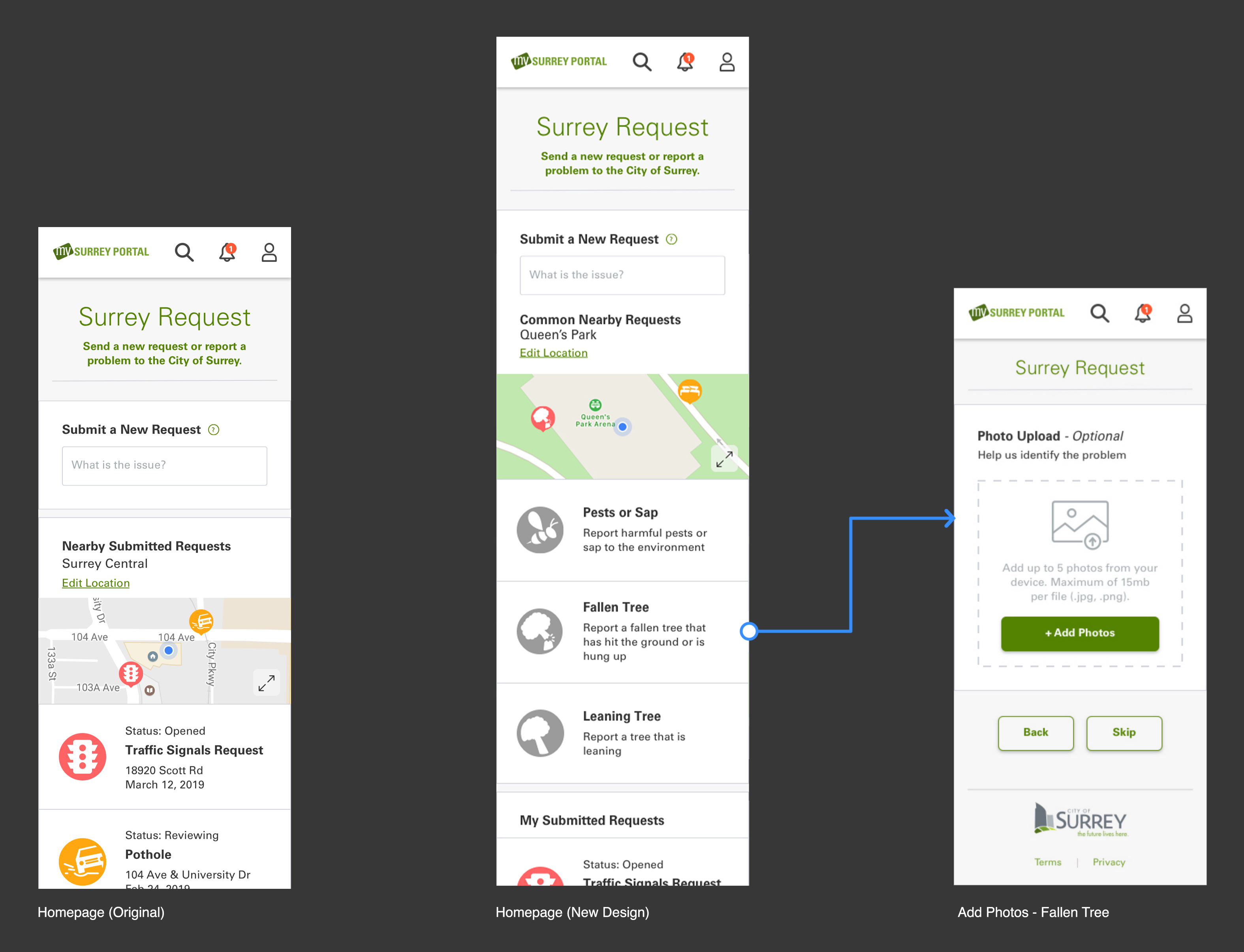
New homepage design suggests 3 common request types near current location to submit a report